
69.57% of online shopping carts are abandoned across industries, which means most stores don't have a traffic problem first. They have a checkout problem first, according to Drip's cart abandonment statistics roundup.
For Australian SMBs, that changes how shopping cart optimization should be approached. Generic advice about prettier buttons and shorter forms only gets you part of the way. Local server latency, mobile-first behaviour, GST expectations, and familiar payment methods all shape whether an Australian shopper finishes the purchase or disappears at the last step.
Table of Contents
- Why Nearly 70% of Your Shoppers Are Leaving
- The Foundation A Fast and Secure Checkout
- Streamlining the User Journey from Cart to Conversion
- Building Trust with Transparent Pricing and Payments
- Winning on Mobile Where Most Aussies Shop
- From Data to Decisions Your Optimisation Roadmap

Performance you can feel, backed by clients who depend on it. Read how our support and uptime create long‑term customer success.Power Your Business with Better Hosting
Why Nearly 70% of Your Shoppers Are Leaving
A shopper in Brisbane can go from ready to buy to gone in under a minute. They tap through from an Instagram or Facebook ad, add two items, open the cart, and hit a few small points of friction at once: slow response, unclear delivery cost, too many fields, or a forced account signup before they can see how they'll pay. For Australian SMBs, abandonment usually looks like that. It is rarely one dramatic failure. It is a stack of hesitations.
Baymard Institute's checkout research puts the average documented online cart abandonment rate at a high level across industries, and their analysis consistently shows that extra costs, forced account creation, and a long or complicated checkout sit near the top of the problem set. Those are not abstract UX issues. They are revenue leaks in the exact part of the funnel where purchase intent is strongest.
The Australian context sharpens this further.
Local shoppers expect prices to make sense quickly. If GST treatment feels unclear, shipping appears late, or the final total changes too far into checkout, trust drops fast. The same applies to payment expectations. A store targeting Australian buyers but presenting awkward currency cues, limited local payment options, or delivery language that feels imported creates doubt at the worst possible moment.
If you want a broader breakdown of friction points, CartBoss has a practical summary on why shoppers abandon their carts.
One practical rule helps here. Audit checkout friction in layers: speed, form effort, price clarity, and trust cues. That is usually more useful than arguing about button colour or headline copy.
I see this often with smaller WooCommerce and Shopify stores. The owner focuses on product pages and ad spend, but the cart still uses a default flow that asks for information too early, hides delivery costs until late, and runs on hosting that is not tuned for eCommerce traffic. The result is predictable. Strong buying intent gets wasted by avoidable checkout work. Choosing WordPress hosting for eCommerce stores that is built for local performance and transactional reliability helps remove one of those friction layers before you touch design.
Shopping cart optimization works when it removes reasons to pause. For Australian stores, that usually means fewer form steps, earlier pricing clarity, faster cart behaviour for local users, and a checkout flow that feels familiar to someone buying from an Australian business.
The Foundation A Fast and Secure Checkout
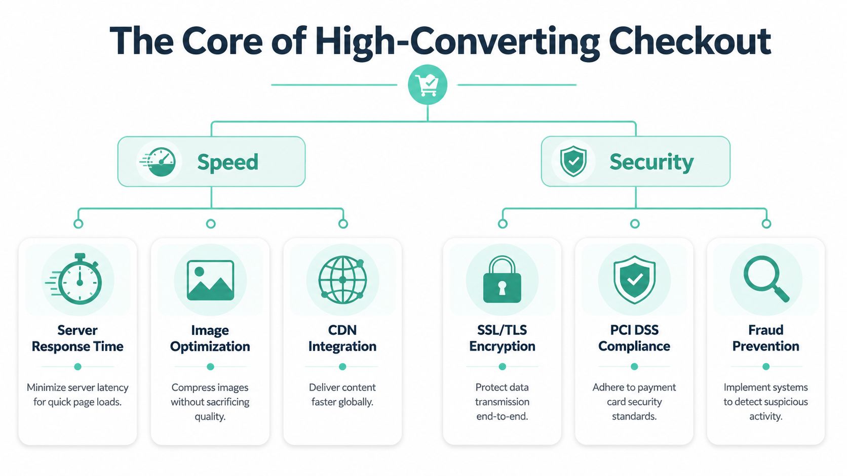
A checkout can look polished and still underperform if the infrastructure underneath it is weak. Customers don't separate hosting, page rendering, and UX in their heads. They just feel whether the site responds quickly enough to trust with their card details.
Speed problems show up as sales problems
Australian stores often overlook geography. If your customers are local but your hosting sits far from them, every cart update has further to travel. That matters more on mobile, where shoppers are already less patient and often checking out over variable connections.
There's a useful Australian benchmark here. UpTime's fast web hosting guidance notes a gap in hard data, but AU-specific benchmarks suggest local hosting can reduce abandonment by 3-5% compared to offshore servers during peak business hours, tied to sub-10ms latency and the context of 20.8% mobile cart abandonment in Australia. For a store selling nationally, that's a commercial reason to choose local infrastructure, not just a technical preference.
I've seen this play out in a very ordinary scenario. A WooCommerce cart with coupon logic, shipping calculation, and payment scripts can feel acceptable on desktop broadband, then sluggish on an iPhone over mobile data. The merchant blames WooCommerce. The underlying issue is often a mix of server distance, uncached assets, and too many third-party scripts.
Three fixes usually matter first:
- Keep hosting local: Sydney or Melbourne server locations usually make more sense for Australian traffic than offshore hosting.
- Use performance tooling that effectively helps dynamic sites: LiteSpeed, efficient caching rules, and image optimisation reduce the lag shoppers feel between each step.
- Audit app bloat on checkout: Reviews widgets, chat popups, heatmaps, and badge scripts often add more friction than value on the payment path.
If you're running WordPress or WooCommerce, it's worth reviewing hosting built for transactional performance rather than generic brochure sites. A good reference point is this guide to best WordPress hosting for eCommerce.
Security has to be visible, not assumed
Speed gets the customer to the payment page. Security gets them over the line.
SSL is the baseline. If a checkout isn't encrypted, the store looks broken. Beyond that, visible trust matters. Shoppers scan for padlocks, secure payment interfaces, and anything that reduces the anxiety spike that happens when they're about to enter payment details.
A secure checkout shouldn't make people think about security. It should remove reasons to doubt it.
For SMBs, that means a few practical choices. Use a proper SSL certificate, keep plugins updated, run malware scanning, and place trust signals close to payment actions instead of burying them in the footer. On the operations side, DDoS protection, off-site backups, and account isolation also matter because a slow or compromised checkout loses sales long before the support inbox fills up.
The trade-off is straightforward. Fancy frontend improvements won't rescue a cart that feels delayed or unsafe. Build the technical base first, then optimise the experience on top of it.
Host your website with our 5-star rated, cPanel website hosting plans.
Super fast servers, with security included and hosted in your choice of Australian Data Center.
View cPanel Plans
Streamlining the User Journey from Cart to Conversion
Once the checkout is fast enough to trust, the next job is reducing effort. Good shopping cart optimization removes unnecessary actions. It doesn't ask the customer to be patient, careful, or committed.
Cut fields before you rewrite copy
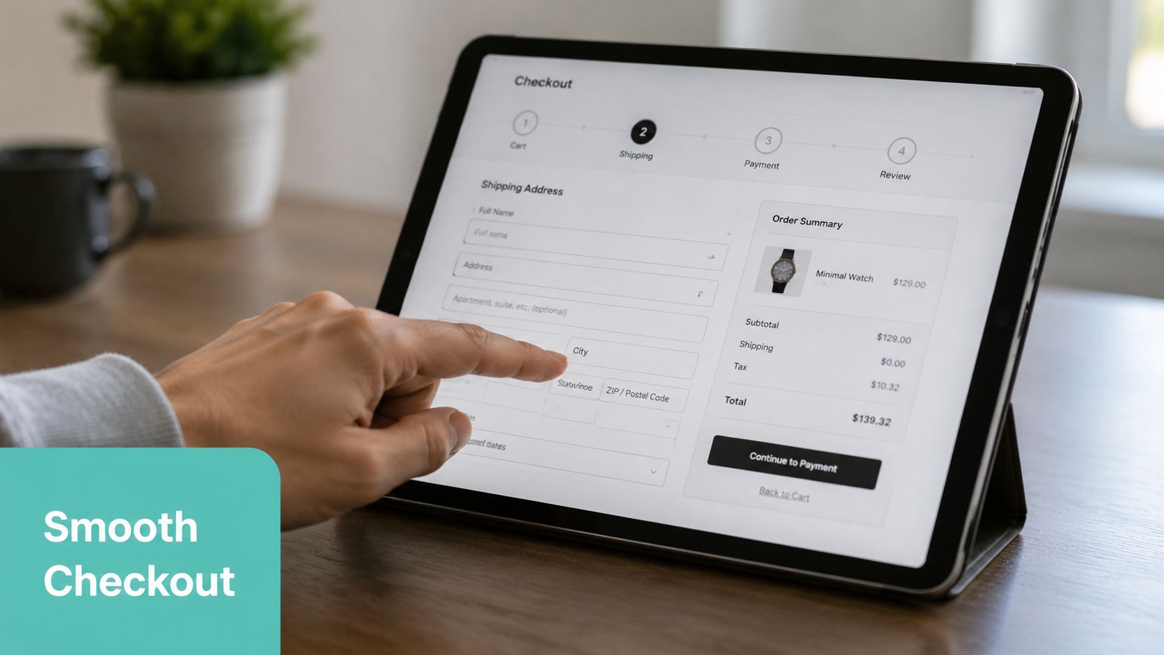
Most struggling checkouts ask for too much, too early. If a field doesn't help fulfil the order, prevent fraud, or communicate delivery, question it.
The fastest improvements usually come from form reduction:
- Remove non-essential inputs: Company name, title, and extra profile details rarely belong in a standard consumer checkout.
- Use address help: Auto-suggest reduces typing and cuts input mistakes before they become failed deliveries.
- Let people buy first: Guest checkout reduces resistance for first-time shoppers who don't want another password.
The principle is backed by practical checkout data. Clyde's guide to shopping cart best practices notes that when retailers integrate digital wallets like Apple Pay and Google Pay and use auto-suggest features to minimise text input, conversion rates improve substantially.
One common mistake is trying to “improve UX” with copy alone while leaving the form structure intact. Renaming “Billing Information” to “Your Details” won't help much if the checkout still asks for twice the information it needs.
A better pattern is simple: email, name, delivery details, payment. Keep optional fields clearly optional. Show errors inline. Don't wait until the customer clicks the final button to reveal three validation issues at once.
Good checkout UX feels obvious
The best user journey rarely gets noticed. It feels direct. Each step answers the next obvious question without adding doubt.
That's where layout and interaction design matter. If you're reworking a clunky cart or checkout, it helps to look at teams that specialise in strategic UX design, especially when the issue isn't one broken element but the whole flow.
A few patterns consistently work well for Australian SMB stores:
Guest checkout first, account creation later
Invite customers to create an account after purchase, when the transaction is already complete.Clear order summary throughout
Keep product names, quantities, shipping selection, and totals visible so customers don't feel they're buying blind.Microcopy that reduces hesitation
Short notes such as “Used for delivery updates only” beside a phone field can prevent abandonment better than a larger redesign.Logical form tools
If you need custom fields in WordPress, build them carefully rather than piling on plugin defaults. This walkthrough on how to create forms on WordPress is a useful starting point.
If a customer has to stop and interpret the checkout, the checkout is already underperforming.
One practical example. A skincare brand selling across Australia might use a cart drawer, then a one-page checkout with Shop Pay alternatives, Apple Pay, Google Pay, and address auto-complete. The customer taps through without friction. Compare that to a store that pushes users into a login wall, then splits the process across multiple pages with vague buttons like “Continue”. One feels modern. The other feels risky.
Building Trust with Transparent Pricing and Payments
Trust is built long before a customer enters their card number, but it peaks at the final step. At this point, shopping cart optimization becomes less about layout and more about reassurance.
Unexpected costs kill intent
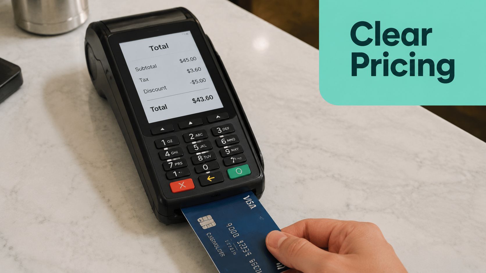
Australian shoppers expect clarity. If the checkout reveals delivery fees, taxes, or payment surprises too late, the store looks evasive even when the pricing is technically correct.
That's one reason transparent presentation matters. Show product subtotal, shipping, and tax treatment early. For B2B and service-based stores, GST-inclusive presentation can also influence perceived credibility. Buyers don't like doing mental reconciliation at the point of payment. They want to know what the charge means.
This isn't just about the order itself. Australian SMBs also respond to transparent billing from the businesses they buy from. In practice, merchants who value no-hidden-fees pricing in their own software and hosting tend to understand why their customers want the same honesty at checkout.
Use a simple review process on every cart page:
- State shipping clearly: If rates vary, say so early and show the available method as soon as the address is known.
- Avoid late fee surprises: Don't wait until the final payment screen to reveal processing-related conditions.
- Keep the total visible: A persistent summary lowers anxiety because the customer can verify the order at a glance.
Payment choice is a trust signal
The payment methods you offer tell the customer whether your store understands local buying behaviour. If an Australian shopper reaches checkout and can't use a familiar option, many will leave rather than adapt.
There's a practical benchmark for this from an Australian hosting knowledge base. UpTime's payment gateways article notes that offering guest checkout as standard can lead to a 15% lift in conversion for Australian retailers, and displaying trust badges from local providers can increase customer confidence by 22%.
That's why payment pages should do three jobs at once. They should let the customer pay the way they prefer, confirm the site is secure, and remove ambiguity about what happens next.
For many Australian SMBs, that means supporting a mix such as:
- PayPal: Familiar and fast for customers who don't want to enter card details directly.
- Afterpay and Zip: Important when the category or order value makes instalments attractive.
- Apple Pay and Google Pay: Strong options for mobile convenience.
- Standard cards: Still expected, but they shouldn't be the only route.
A visible SSL indicator also helps, especially when it's paired with a concise explanation of secure checkout. If your WordPress site still lacks that foundation, this guide on free SSL certificates for WordPress covers the basics.
Shoppers don't need dozens of payment logos. They need the right few, shown clearly, in a checkout that doesn't look improvised.
Winning on Mobile Where Most Aussies Shop
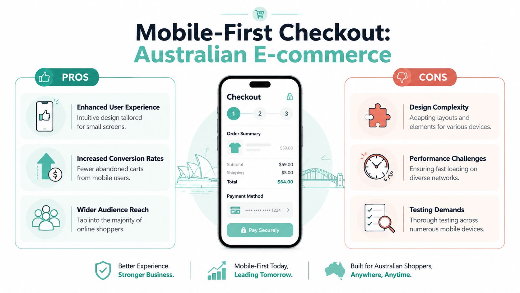
If your mobile checkout is awkward, you're losing customers in the environment where most of them complete purchases. As of 2025, 72% of Australian e-commerce transactions occur on mobile devices, and retailers using thumb-friendly layouts plus mobile wallet integrations achieve a 28% higher conversion rate than those without, according to UpTime's website builder resource.
Design for thumbs, not mouse pointers
Desktop habits often ruin mobile checkout. Store owners test on a laptop, approve the design, then wonder why conversion lags. On a phone, spacing, reach, and input friction matter more than visual polish.
A thumb-friendly checkout usually has these characteristics:
- Large tap targets: Buttons and selectors need enough space to avoid accidental taps.
- Reachable calls to action: Primary actions should sit where a user can comfortably tap with one hand.
- Short visible forms: Long vertical stacks feel heavier on mobile than on desktop.
- Minimal distractions: Coupon boxes, upsell popups, and sticky chat widgets often get in the way on smaller screens.
One practical example is the shipping step. On desktop, a set of tightly packed radio buttons may look tidy. On mobile, the same control can become a mis-tap trap. A better option is larger selectable cards with clear labels and price visibility.
Mobile wallets remove the worst part of checkout
The hardest part of mobile checkout is manual entry. Typing card numbers, billing addresses, and postcodes on a small screen is slow and error-prone. That's why Apple Pay and Google Pay often outperform standard card forms in mobile-heavy stores. They remove the most frustrating part of the experience.
This matters even more when your traffic comes from Instagram, Facebook, TikTok, or email campaigns opened on a phone. Those shoppers are already in a compressed attention window. If your store asks them to complete a desktop-style checkout on mobile, many won't bother.
A practical mobile checklist looks like this:
| Mobile element | What good looks like |
|---|---|
| Checkout button | Visible early and easy to tap |
| Form fields | Correct keyboard type and limited typing |
| Order summary | Collapsed but accessible |
| Payment options | Wallets shown before full card entry |
| Theme layout | Responsive and uncluttered |
If your WooCommerce store still uses a theme that treats mobile as an afterthought, start there. A well-built WooCommerce theme for Australian stores gives you a better base than trying to patch a desktop-first layout with custom CSS.
Mobile optimisation isn't shrinking the desktop checkout. It's rebuilding the path around how people actually use their phones.
Register your new domain name at competitive market prices including free domain add-ons like privacy, DNS Hosting, Custom Nameservers and Forwarding.
Always the best price and no nasty renewal price hikes.
Register A Domain Name
From Data to Decisions Your Optimisation Roadmap
The stores that improve checkout performance steadily aren't guessing. They identify where users drop off, change one meaningful variable at a time, and keep what proves useful.
That sounds simple, but many SMBs skip it. They redesign the whole cart, swap themes, add new plugins, and change payment tools in the same month. Then they can't tell which decision helped and which one made things worse.
What to measure inside your checkout
Start with the basic funnel. Track product page visits, add-to-cart events, cart views, checkout starts, payment attempts, and completed orders. You don't need enterprise tooling to learn from that sequence. You just need clean event tracking and the discipline to review it regularly.
Then look for specific friction patterns:
Cart views are strong, checkout starts are weak
The cart page itself is likely creating doubt. Common culprits include poor shipping visibility, weak calls to action, or unnecessary distractions.Checkout starts are healthy, but payment completion drops
That usually points to trust, payment choice, or form friction.Mobile performs far worse than desktop
The issue is rarely “mobile traffic quality”. It's usually usability.
One thing I recommend is pairing analytics with session observation. Watch a handful of real customer journeys if your platform allows it. You'll often find issues no dashboard can explain cleanly, such as coupon fields drawing attention away from checkout or autofill breaking on suburb fields.
For merchants looking beyond checkout alone, broader eCommerce growth tips can help prioritise where conversion work belongs across the whole store.
Prioritised Shopping Cart Optimisation Checklist
Don't tackle everything at once. Fix the highest-friction issues first, then test the next layer.
| Priority | Action Item | Area of Impact |
|---|---|---|
| High | Move hosting and core site delivery closer to Australian users if your store is served offshore | Speed, mobile responsiveness, checkout completion |
| High | Enable guest checkout and remove any forced account gate before payment | Friction reduction, first-time buyer conversion |
| High | Show full order costs as early as possible, including clear shipping and GST treatment where relevant | Trust, cart completion |
| High | Add Apple Pay and Google Pay where supported | Mobile checkout speed, reduced text input |
| Medium | Simplify fields and use address auto-suggest | Form completion, accuracy |
| Medium | Review trust signals near payment, including SSL and credible badges | Confidence at payment stage |
| Medium | Strip non-essential scripts from cart and checkout pages | Load speed, stability |
| Medium | Test mobile button placement and thumb reach on real devices | Mobile usability |
| Lower | Refine checkout copy, labels, and helper text | Clarity, reduced hesitation |
| Lower | Run structured A/B tests on one change at a time | Ongoing optimisation discipline |
A/B testing matters here because checkout opinions are cheap and store-specific evidence is what counts. If your team thinks a longer order summary helps, test it. If someone wants the coupon field moved, test that too. Shopping cart optimization works best when decisions come from observed behaviour, not internal preference.
There's also a broader local angle worth keeping in mind. Technical choices that seem unrelated to checkout can still influence sales. Hosting location can affect responsiveness for Australian users. Site reliability affects trust. Even local search visibility shapes the quality of traffic entering the funnel in the first place. That's why work on checkout often pairs well with stronger local SEO for Australia, especially for stores serving defined regions or metro markets.
The practical sequence is simple. Fix speed. Cut friction. Make pricing obvious. Support local payment expectations. Then measure what changed. That's the version of shopping cart optimization that usually delivers results for Australian SMBs.
If your store needs a faster local foundation before you optimise the checkout itself, UpTime Web Hosting offers Australian hosting with local server locations, free SSL, strong security features, and transparent GST-inclusive pricing that suits SMB eCommerce sites.